
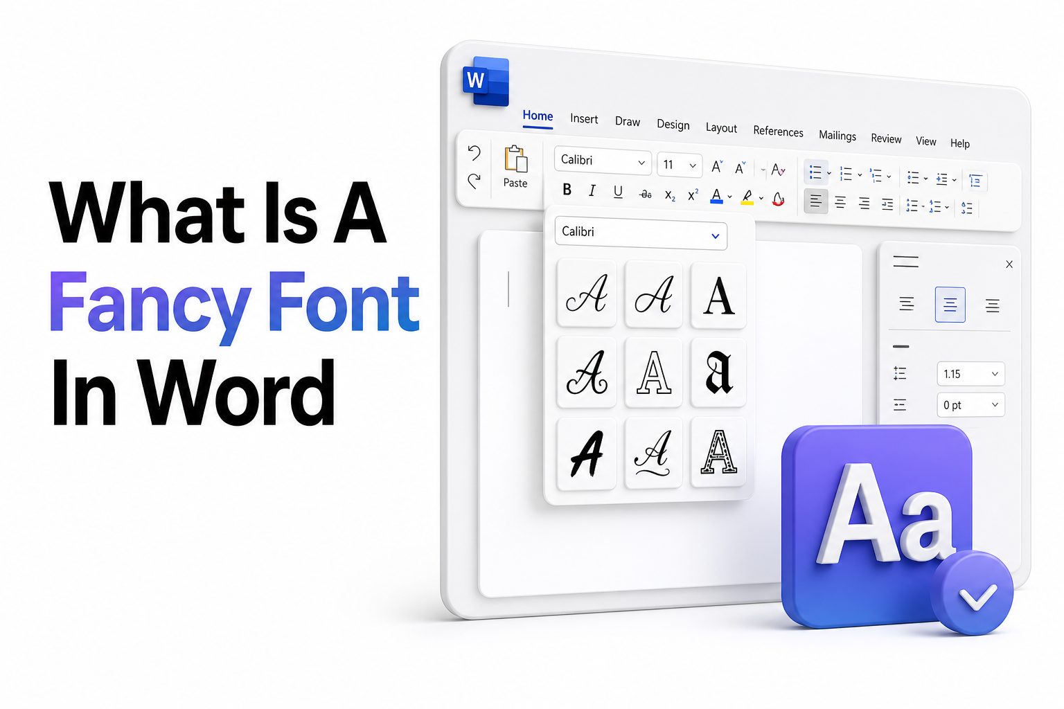
If you have ever opened Microsoft Word, clicked the font menu, and wondered what is a fancy font in word, you are really asking how to make text look more stylish, expressive, or decorative without making it hard to read. A fancy font is not one single typeface. It usually refers to fonts that feel elegant, artistic, formal, playful, handwritten, or visually distinctive compared with basic options like Arial or Calibri.
Fancy fonts can make invitations, certificates, flyers, menus, labels, resumes, posters, and social media graphics look more polished. The key is knowing when to use them and when to hold back. A beautiful font can improve a document, but too much decoration can quickly make it look cluttered. Microsoft Word includes several built-in fonts that can create a fancy look, and you can also install custom fonts for more specific styles. The best choice depends on the purpose of your document, your audience, and how readable the text needs to be.
What a Fancy Font Means in Microsoft Word
A fancy font in Microsoft Word is any font that adds personality, decoration, or visual style beyond standard body text. These fonts may include script lettering, calligraphy styles, serif fonts with elegant details, vintage display fonts, or modern decorative typefaces used for titles and headings.
The word “fancy” is informal, so it can mean different things depending on the document. For a wedding invitation, fancy may mean flowing script. For a certificate, it may mean formal calligraphy. For a poster, it may mean bold decorative lettering that catches attention quickly.
Why People Use Fancy Fonts in Word
People use fancy fonts because typography changes how a document feels before anyone reads a full sentence. A plain font can look practical and neutral, while a decorative font can make the same words feel formal, creative, festive, luxurious, or personal.
Fancy fonts are especially useful when the document has a visual purpose. Invitations, event programs, greeting cards, classroom materials, restaurant menus, and branded handouts all benefit from type that supports the mood. The goal is not decoration alone, but better communication through style.
Common uses for fancy fonts in Word:
- Wedding invitations and save-the-date cards
- Certificates, awards, and diplomas
- Party flyers and event posters
- Restaurant menus and product labels
- Greeting cards and thank-you notes
- Creative resumes and portfolios
- Classroom worksheets and bulletin materials
- Brand documents, headers, and cover pages
Best Built-In Fancy Fonts in Microsoft Word
Microsoft Word includes several fonts that can look fancy without requiring downloads. Popular choices often include Edwardian Script ITC, French Script MT, Kunstler Script, Lucida Calligraphy, Monotype Corsiva, and Vivaldi. These are commonly used for invitations, titles, certificates, and formal decorative text.
Some built-in serif fonts can also create a refined look. Garamond, Georgia, Baskerville, and Constantia are less ornate than script fonts, but they feel polished and classic. They work well when you want elegance without sacrificing readability across longer sections.
Script Fonts for Elegant Documents
Script fonts imitate handwriting, calligraphy, or brush lettering. They are often the first style people think of when searching for fancy fonts in Word. These fonts can look graceful on invitations, name cards, headers, and personal notes.
The main risk with script fonts is readability. Long paragraphs in script can strain the eyes, especially when printed small. Use script fonts for names, short phrases, titles, or accents, then pair them with a cleaner font for supporting information.
Serif Fonts for a Classic Fancy Look
Serif fonts have small strokes at the ends of letters, giving them a traditional and refined appearance. In Word, fonts like Garamond, Georgia, and Baskerville can feel elegant without looking overly decorative. They are suitable for formal letters, programs, reports, and printed materials.
A serif font is often a better choice when the document must look professional and readable. It adds character while keeping the page clean. For example, a certificate title may use script, while the recipient details can use a refined serif font.
Fancy Font Style Comparison
Font Style | Best For | Readability | Example Use
Script | Invitations, names, headings | Low to medium | Wedding title
Calligraphy | Certificates, formal designs | Medium | Award heading
Serif | Formal documents, programs | High | Event brochure
Decorative display | Posters, flyers, labels | Medium | Sale headline
Handwritten | Notes, classroom designs | Medium | Greeting card
Modern elegant | Menus, portfolios, branding | High | Resume header
How to Find Fancy Fonts in Word
To find fancy fonts in Word, select your text and open the font dropdown from the Home tab. Scroll through the list and preview different options directly on your document. Word shows fonts installed on your computer, not just fonts created by Microsoft.
A practical method is to type your heading first, make it large enough to preview clearly, then test several fonts in context. A font that looks beautiful in the dropdown may not work well with your actual words, spacing, or page layout.
How to Install More Fancy Fonts for Word
If Word does not include the style you want, you can install additional fonts on your computer. Once installed, those fonts usually appear in Word automatically. Trusted font sources include Google Fonts, Adobe Fonts, Microsoft Store fonts, and reputable type foundries.
Before downloading, check the license carefully. Some fonts are free for personal use but require payment for business, client, or commercial projects. This matters if you are designing menus, logos, products, marketing materials, or anything connected to a business.
Choosing the Right Fancy Font for Your Document
The right fancy font depends on the tone of your document. A graduation certificate needs a different style from a birthday invitation or bakery menu. Start by deciding whether the document should feel formal, romantic, playful, modern, vintage, artistic, or luxurious.
After that, consider the reading environment. A printed invitation can handle delicate details, while a flyer viewed from a distance needs stronger letter shapes. If people must read the information quickly, choose a decorative font only for the headline.
Checklist for Choosing a Fancy Font
- Match the font style to the document purpose
- Test the font at the final printed or screen size
- Use fancy fonts for short text, not dense paragraphs
- Pair decorative fonts with simple supporting fonts
- Check spacing between letters and lines
- Avoid fonts that make similar letters confusing
- Print a sample before finalizing formal materials
- Confirm commercial licensing when needed
Best Fancy Fonts for Invitations in Word
Invitations often benefit from soft, elegant, or handwritten-looking fonts. Lucida Calligraphy, Edwardian Script ITC, and Monotype Corsiva can work well for names, event titles, and short decorative lines. These fonts give invitations a personal and formal feel.
For the details, use a clean serif or simple sans serif font. Date, time, location, and RSVP information should be easy to read. A beautiful invitation can still fail if guests struggle to find the key details quickly.
Best Fancy Fonts for Certificates and Awards
Certificates usually need a formal, dignified style. Calligraphy-inspired fonts such as Old English Text MT, Vivaldi, and Edwardian Script ITC can suit headings or recipient names. These fonts help create a traditional award appearance.
For the rest of the certificate, use a readable serif font. The recipient’s name may be decorative, but the achievement, issuing organization, and date should remain clear. Good certificate design balances ornament with authority.
Tips for Fancy Font Pairing
- Pair a script heading with a simple serif body font
- Use one decorative font and one plain font
- Avoid combining two highly ornate fonts
- Keep font weights balanced across the page
- Use size and spacing to create contrast
- Make names or titles the decorative focus
- Choose fonts that share a similar mood
- Limit most documents to two font families
Best Fancy Fonts for Resumes and Professional Documents
Fancy fonts can work on resumes, but they require restraint. A resume should look polished, organized, and easy to scan. Decorative fonts are usually best limited to your name or section headings, not job descriptions or bullet points.
Modern serif fonts and clean professional typefaces are often safer than heavy script fonts. Garamond, Georgia, Cambria, and Constantia can add style while staying readable. For more resume formatting ideas, see [Internal Link: Professional Resume Font Tips].
Best Fancy Fonts for Menus and Product Labels
Menus and product labels often need fonts that suggest a brand personality. A bakery may use warm handwritten lettering, while a fine dining menu may use an elegant serif. A craft brand might choose vintage display lettering for a more handmade feel.
Clarity still matters because customers need to read names, ingredients, prices, and descriptions. Use the fanciest font for the restaurant name, product title, or category heading. Keep the practical information in a simple companion font.
How Font Size Affects Fancy Fonts
Fancy fonts often need more space than standard fonts because their strokes, loops, and flourishes can overlap when set too small. A script font that looks elegant at 28 points may become hard to read at 11 points.
When using decorative fonts, increase line spacing and check letter spacing when needed. Larger sizes also help preserve fine details in printed documents. Always review the document at actual size instead of judging only from a zoomed-in screen view.
Important Facts About Fancy Fonts
- Fancy fonts are best for emphasis, not full pages of text
- Readability matters more than decoration
- Built-in Word fonts vary by device and Office version
- Custom fonts may not display correctly on another computer
- PDF export helps preserve your font choices
- Some decorative fonts require commercial licenses
- Script fonts usually need larger sizes
- Simple font pairings look more professional
How to Use Fancy Fonts Without Looking Unprofessional
A fancy font looks professional when it supports the message instead of distracting from it. Use it where the reader expects emphasis, such as a title, name, heading, logo-style text, or special announcement. Keep surrounding text clean and structured.
Avoid using too many font styles in the same document. One fancy font is usually enough. If every heading, label, quote, and paragraph uses a different decorative style, the page loses focus and starts to feel amateur.
Mistakes to Avoid With Fancy Fonts
The most common mistake is using a fancy font for long paragraphs. Decorative letters slow reading because the eye must work harder to identify each word. This is especially true with script, blackletter, and highly stylized display fonts.
Another mistake is choosing style over context. A playful font may look charming, but it can feel wrong on a legal notice, formal report, or business proposal. The font should fit the occasion, not simply look interesting.
Practical Fancy Font Examples in Word
For a wedding invitation, you might use Edwardian Script ITC for the couple’s names and Garamond for the date and venue details. This keeps the design elegant while making the essential information readable for every guest.
For a business certificate, you might use Vivaldi for the award title and Georgia for the recipient details. For a flyer, you might use a bold decorative display font for the headline and Calibri or Aptos for event information.
When to Use a Plain Font Instead
A plain font is better when the document’s main purpose is fast reading, official communication, or detailed information. Contracts, academic papers, technical manuals, medical forms, and business reports usually need clarity more than decoration.
Plain fonts also work better when the document will be edited by multiple people. If another computer does not have your custom fancy font installed, Word may substitute a different font and change the layout unexpectedly.
Quick Rules for Professional Font Use
- Use fancy fonts only where emphasis is needed
- Keep body text simple and readable
- Use consistent heading styles throughout the document
- Save final designs as PDF before sharing
- Test printed quality before ordering copies
- Avoid all caps in script fonts
- Do not shrink decorative fonts too much
- Make accessibility part of the design decision
How to Pair Fancy Fonts With Body Text
Font pairing works best when the fonts have clear roles. The fancy font should create mood and visual interest, while the body font should carry information. This division keeps the document attractive without making it tiring to read.
For example, pair a script font with Garamond, Georgia, Cambria, Aptos, or Calibri. Pair a vintage display font with a neutral sans serif. Pair a formal calligraphy font with a classic serif. Contrast is useful, but the styles should still feel connected.
Using Fancy Fonts for Headings and Titles
Headings are ideal places for fancy fonts because they are short and naturally meant to stand out. A decorative heading can set the tone before the reader gets into the details. This works well for programs, flyers, invitations, and cover pages.
Keep headings readable by avoiding excessive effects. Shadows, outlines, gradients, and heavy colors can make an already decorative font harder to read. A strong font choice, good size, and enough white space usually create a cleaner result.
Fancy Fonts and Accessibility
Accessibility is important when choosing any font. Decorative fonts can be difficult for readers with low vision, dyslexia, or visual processing challenges. Thin strokes, tight spacing, and unusual letter shapes can reduce readability, even when the design looks attractive.
To improve accessibility, use fancy fonts sparingly and maintain strong contrast between text and background. Avoid placing decorative text over busy images. If the information is essential, choose a readable font and reserve the fancy style for decoration.
Fancy Fonts for Digital Versus Printed Documents
Printed documents often show decorative details better than screens, especially on high-quality paper. Invitations, certificates, labels, and menus can benefit from subtle curves and fine strokes. However, print quality depends on paper, ink, printer resolution, and font size.
Digital documents need extra caution. A font that looks refined on your screen may appear thin or cramped on a phone or older monitor. If the file will be emailed, exported, or uploaded, test it as a PDF before sharing.
Useful Fancy Font Combinations
Fancy Font | Supporting Font | Best Use
Edwardian Script ITC | Garamond | Wedding invitations
Lucida Calligraphy | Georgia | Formal announcements
Vivaldi | Cambria | Certificates
Monotype Corsiva | Aptos | Greeting cards
Old English Text MT | Times New Roman | Traditional awards
Modern script font | Open Sans | Labels and flyers
How to Make Fancy Fonts Look Better in Word
A fancy font often looks better with careful spacing. Increase the font size, adjust line spacing, and give the text room to breathe. Crowded decorative lettering loses its charm quickly, especially when loops and strokes sit too close together.
Color also matters. Black, charcoal, navy, deep green, burgundy, and gold tones often work well for elegant documents. Bright colors can be effective for party designs, but formal pieces usually look better with restrained color choices.
Using Word Effects With Fancy Fonts
Microsoft Word includes text effects such as shadows, outlines, reflections, and glow. These can be useful in small doses, but they can also make fancy fonts look cheap if overused. Most decorative fonts already have enough visual detail.
For professional results, use effects only when they improve legibility or match the design purpose. A subtle shadow on a poster headline may help it stand out. A heavy glow around a script invitation title usually makes it harder to read.
How to Share Word Documents With Fancy Fonts
When you send a Word document with custom fonts, the recipient may not see the same design unless they have those fonts installed. Word may replace the missing font, which can change spacing, line breaks, and overall appearance.
The safest option is to export the finished document as a PDF. A PDF preserves the visual layout much better than an editable Word file. For editable files, use common built-in fonts or provide font installation instructions when appropriate.
Where to Get Fancy Fonts Safely
Reliable font sources help you avoid poor-quality files, licensing problems, and security risks. Google Fonts is widely used for free fonts with clear licensing. Adobe Fonts is useful for Creative Cloud users. Microsoft Store fonts can also integrate well with Windows.
Avoid downloading font files from random websites with unclear ownership or excessive pop-ups. If you need fonts for branding, client work, or products for sale, use reputable foundries and keep a record of the license.
Font Download Safety Checklist
- Use trusted font libraries or known foundries
- Read the license before using a font commercially
- Avoid suspicious download buttons and bundled files
- Install only font formats you recognize
- Keep a copy of license terms for client projects
- Test the font in Word before designing the full document
- Export the final document as PDF when sharing
- Remove fonts that cause display or printing issues
Conclusion
A fancy font can make a Word document feel more personal, polished, formal, or creative, but the best results come from using decoration with purpose. Instead of choosing the most ornate option, match the font to the document’s tone, audience, and reading needs. Script and calligraphy fonts work beautifully for names, titles, invitations, and certificates, while elegant serif fonts can create a refined look without reducing readability.
The most reliable approach is to use one decorative font for emphasis and pair it with a clean font for supporting text. Check the design at actual size, print a sample when needed, and save important documents as PDFs before sharing. Once you know what is a fancy font in word, it becomes much easier to choose styles that look attractive, readable, and appropriate for the occasion.
FAQ
What fonts look fancy in Microsoft Word?
Fonts such as Edwardian Script ITC, Lucida Calligraphy, Vivaldi, French Script MT, and Monotype Corsiva often look fancy in Word. Elegant serif fonts like Garamond and Georgia can also create a refined appearance.
Can I add new fancy fonts to Word?
Yes, you can install new fonts on your computer, and Word will usually show them in the font menu. Use trusted font sources and check whether the license allows personal or commercial use.
Which fancy font is best for invitations?
Script and calligraphy fonts usually work best for invitations. Edwardian Script ITC, Lucida Calligraphy, and Monotype Corsiva are popular choices. Use them for names or headings, then use a simpler font for event details.
Are fancy fonts good for resumes?
Fancy fonts can work on resumes only when used carefully. A subtle serif font is usually safer than a decorative script. Keep the main text clean, readable, and professional so hiring managers can scan it quickly.
Why does my fancy font change on another computer?
The other computer may not have the same font installed. Microsoft Word may replace it with a default font, changing the layout. Exporting the document as a PDF helps preserve the original design.
0 Comments